From overwhelm to clarity: redesigning SmartNews' first-time user experience.
Senior Product Designer Working with AI
AI as a design partner
- Built a custom system to generate consistent icon illustrations with AI. Authored structured JSON definitions, then used them to produce precise, style-coherent icons at scale
- Used Midjourney to explore and create micro-interactions, rapidly iterating on motion concepts before translating them into production
The Beginning
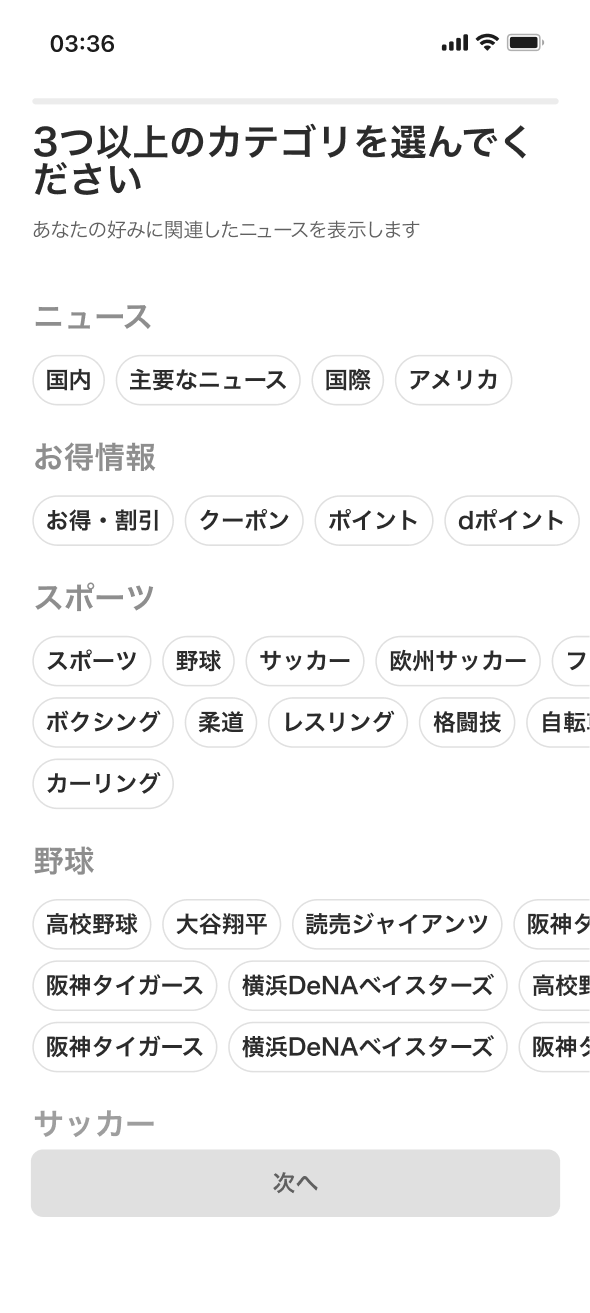
When new users opened SmartNews for the first time, they were met with hundreds of categories to choose from. But most didn't know what they wanted yet — they just wanted to read the news.
Instead, the onboarding became a wall of decisions. Only 37.9% of users completed onboarding, while the rest skipped it entirely.
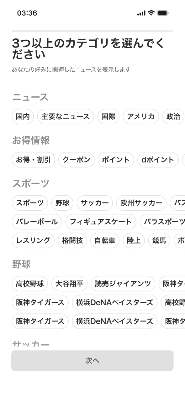
Too many categories
New users often don't know what they want to read yet, but SmartNews presents hundreds of categories at once, creating decision fatigue.
Unclear value
The benefits of choosing categories or enabling notifications aren't clearly communicated, so users don't see the purpose.
Confusing structure
The large number of categories, unclear grouping, and lack of guidance make the onboarding process complicated and hard to complete.
We saw an opportunity
What if we made onboarding less about choosing categories, and more about understanding intentions?
The Journey
After we unearthed useful insights through usage data, inventory analysis, and user research, as a team, we gather and do a brainstorming ideas together to discover possible solution to solve the problems.
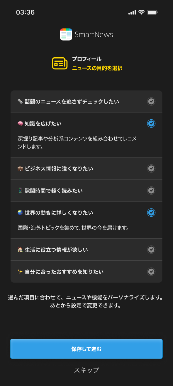
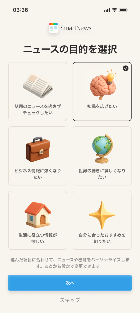
So we reframed the experience around reading intentions — why users open SmartNews in the first place.
Instead of asking "What topics do you like?" we asked "What kind of news experience do you want?"
From there, we narrowed it down to four directions. What would you have chosen? Pick the one you'd ship.
Design evolution
From the existing experience to the final design — drag the handle to explore.
Drag the handle to explore
Design showcase
The shipped experience in motion — welcome and onboarding.
The Ending
- 58.2% onboarding completion rate — up from 37.9%, a +20.3 percentage point improvement.
- +5% DAU among new users in the first month after redesign.
- Reduced decision fatigue by collapsing hundreds of categories into a handful of intent-based choices.
This project reinforced a core belief: less is more in onboarding. The shift from category selection to intention-based choices taught me the power of reframing a question. The underlying logic didn't change much — we were still building a category list — but the way we asked the question transformed the experience.
The Future
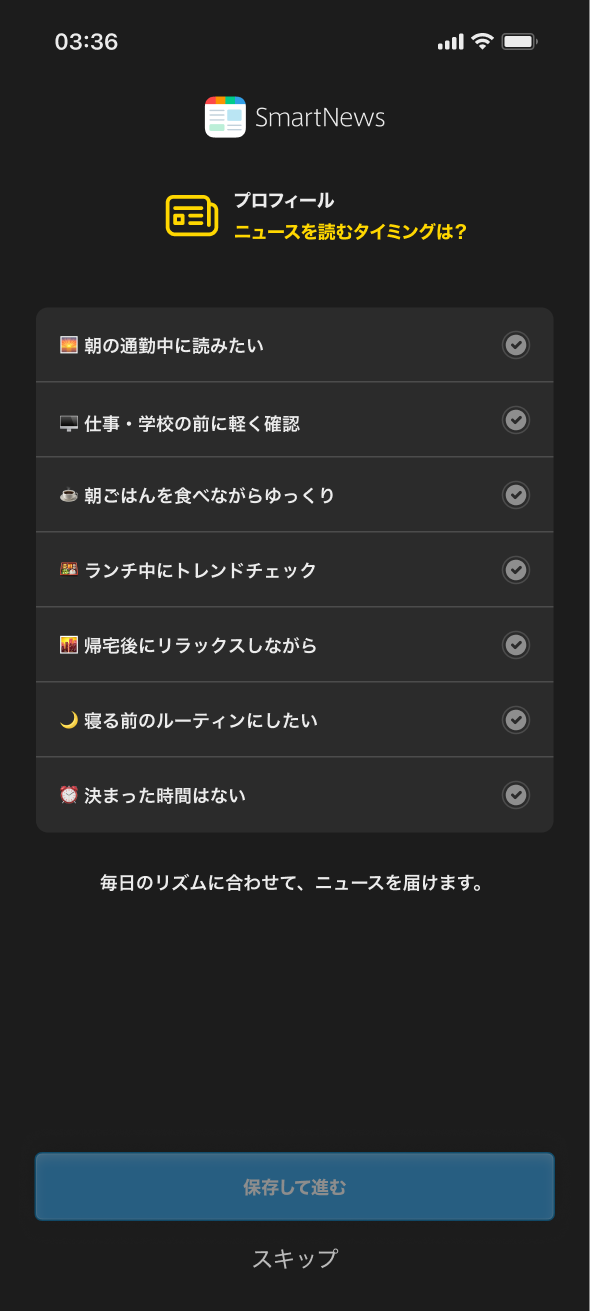
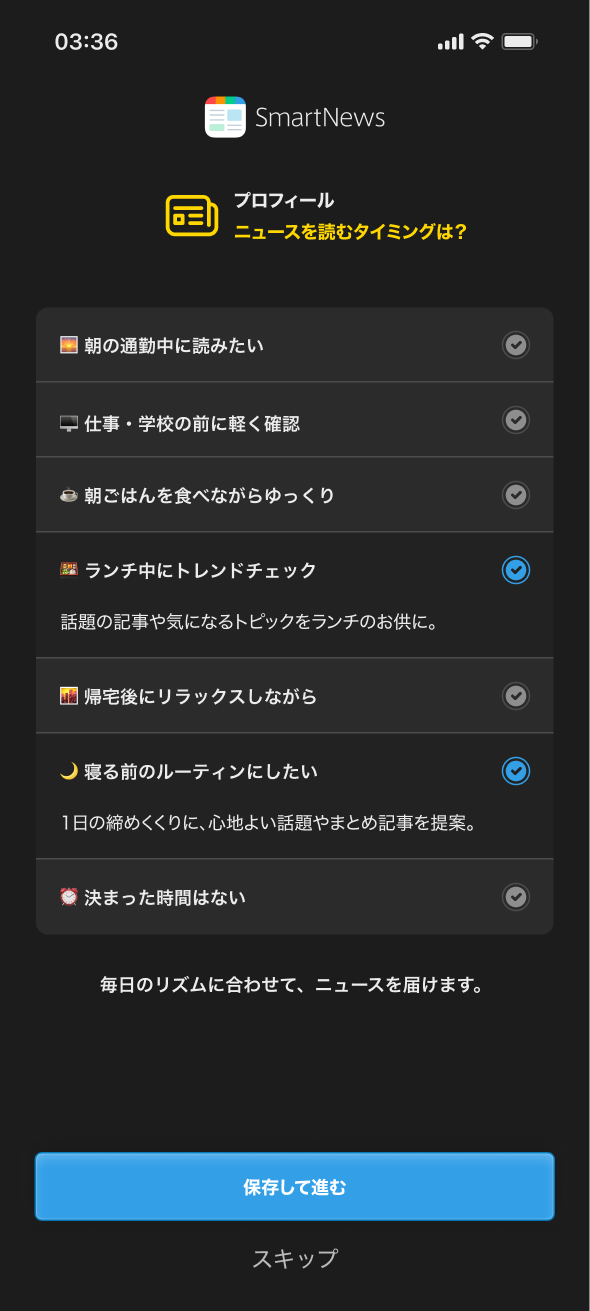
We’re extending the same principle to notification onboarding — instead of asking users to “turn on notifications,” we plan to ask when they prefer to read news, enabling SmartNews to send updates at optimal times.
This approach aims to make permissions feel more relevant and valuable to users while improving engagement with notifications.
By reframing onboarding around intent rather than category, we transformed a cluttered setup into a simple, meaningful experience — helping users feel guided from the start and helping SmartNews connect them to what matters faster.