Turning tiket.com into a destination for travel discovery.
Product Designer & Researcher
Overview
Most OTAs in Indonesia only cover booking, but travel planning begins long before that. With information scattered across sources, this project centralizes everything — from inspiration to booking — for a seamless experience.
Research & Insights
Understanding users
We began by mapping how people currently find travel ideas.
Users relied on blogs, social media, and competitor sites like Trip.com and Klook for inspiration, then switched back to platforms like tiket.com only when ready to book. This fragmented behavior revealed one major insight:
"Travel inspiration and booking were disconnected."
The root cause? Information wasn't centralized. Travelers couldn't explore destinations, learn details, or act on them within a single platform.
Aligning business intentions
We involved internal teams early — from marketing to commercial — to align on shared goals. Each team had different needs:
Wanted flexible campaign pages for influencer collaborations and co-branded content.
Reusable, themed landing pages for brand partnerships
Needed more inventory placements for seasonal promotions — the platform only had limited spaces.
Expand monetizable placements for partnerships and campaigns
Aimed to build a discovery flow that inspired users to explore before booking.
Bridge inspiration and conversion in one experience
Mapping these intentions helped us define a unified north star: create a discovery experience that balances inspiration with conversion.
Key insights
Through behavioral research, we identified three primary drivers behind travel decisions:
- Budget — how much users are willing to spend
- Time — how much time they have and when
- Theme — what kind of experience they want
These became the foundation for our framework.
Strategy & Design
The Labyrinth Framework
We developed the Labyrinth Framework to mirror how travelers actually make decisions — not in a straight line, but through loops of emotion, curiosity, and constraints. It connects Budget, Time, and Theme, helping users explore dynamically while giving teams a shared structure for decision-making.
*Hover to explore connections
*Tap to explore connections
Defining the experience
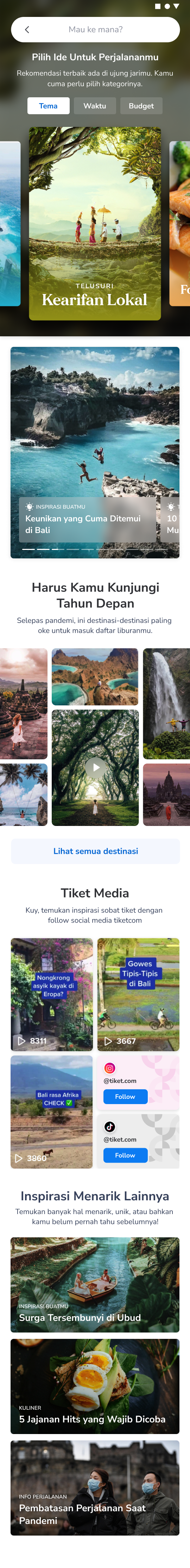
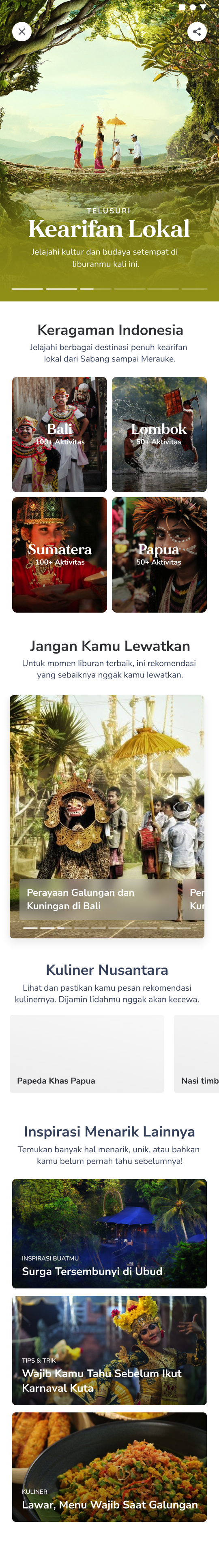
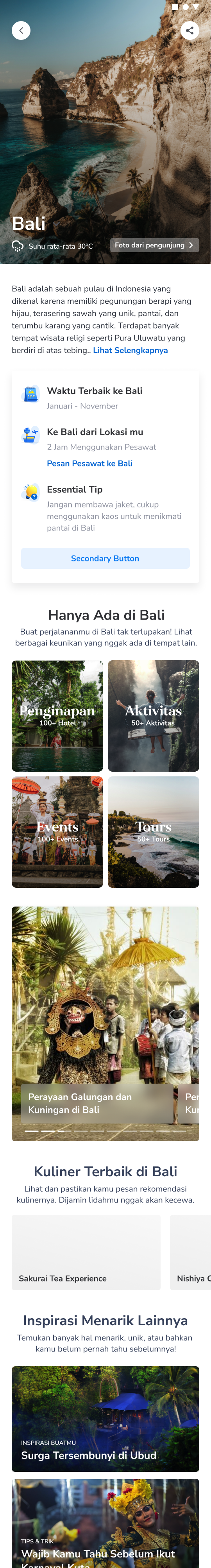
We designed three key pages to guide users from curiosity to conversion:
- Landing Page — sparks exploration through trending destinations and stories.
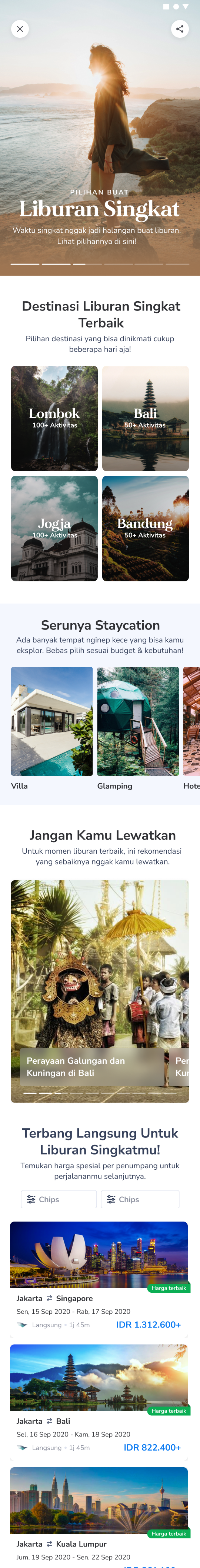
- Curation Page — balances inspiration and offers, tailored to internal team needs.
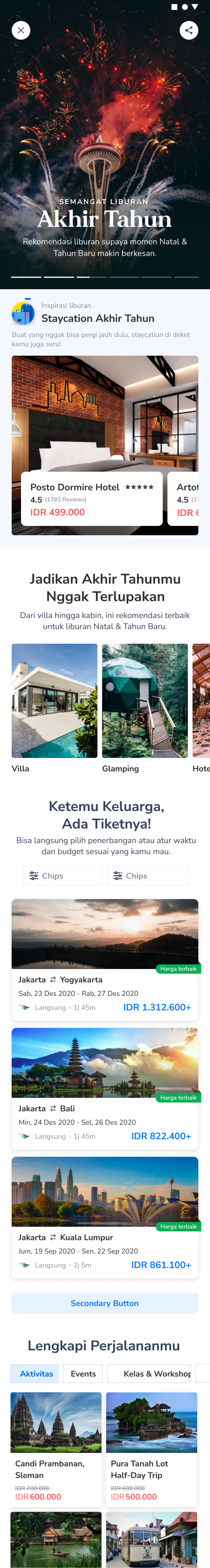
- Destination Page — blends local insights and product details to help users finalize bookings.
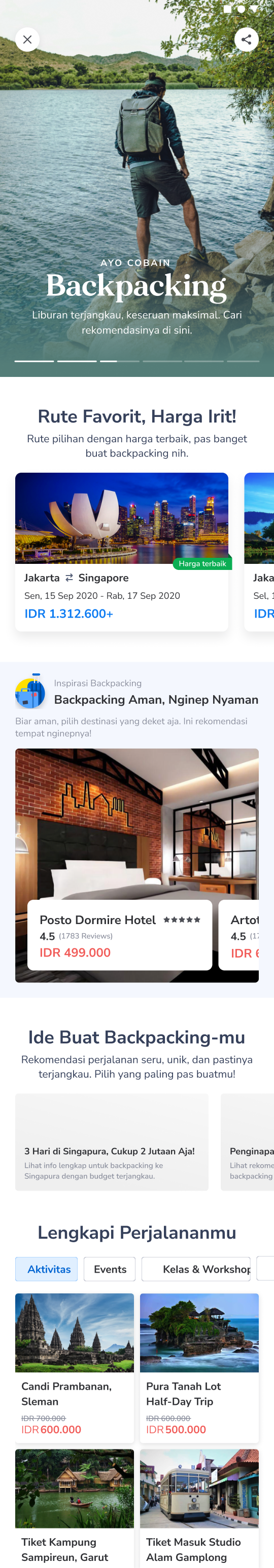
Sparks exploration through trending destinations and stories.
*Hover to explore by category
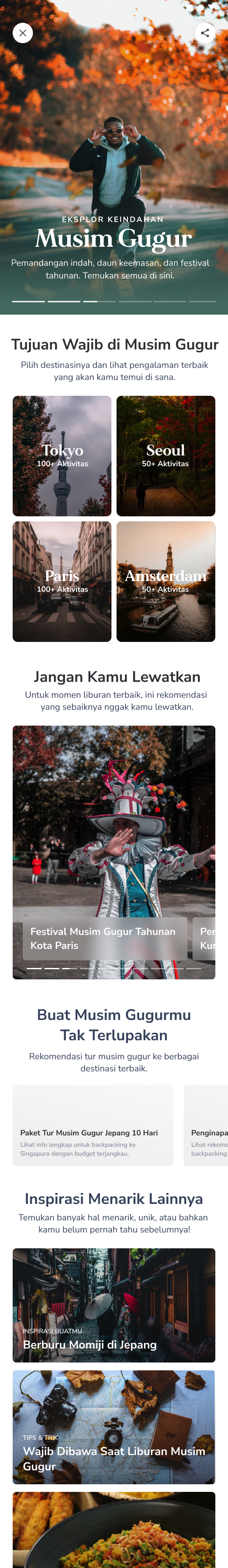
Modular Curation System
To make the system scalable, we built a modular curation framework — allowing different teams to create customized pages (for campaigns, influencer partnerships, or travel themes) while maintaining a consistent user experience.
Local travel
Theme-based editorial discovery
Drag the handle to explore curation types
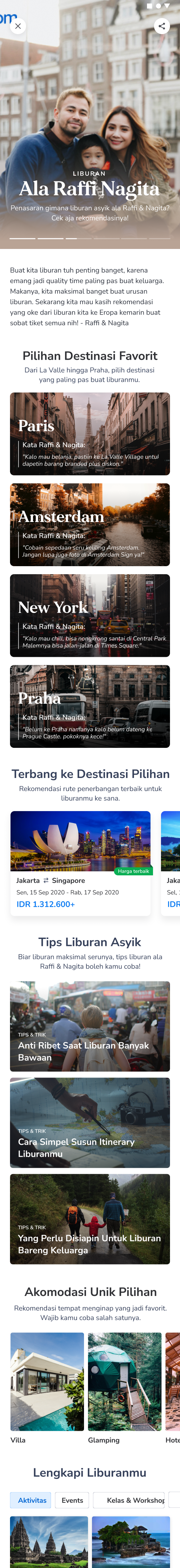
Based on theme · Local travel
Impact
The Discover feature evolved into a flexible ecosystem that unified multiple teams and user needs under one coherent system — shifting tiket.com's identity from a booking tool to a travel discovery platform.
- Boosted DAU (Daily Active Users) — by expanding beyond transactions to inspiration and storytelling.
- Increased brand collaborations — by offering a single, themed source of truth for campaigns and influencer partnerships.
- Improved internal efficiency — content, marketing, and product teams could now manage promotions and content within one shared tool.
- Increased revenue — from both bookings and new brand partnership deals.
Learnings
Building Discover was like designing a small ecosystem within a larger product. It wasn't just about user experience — it was about aligning multiple disciplines, balancing emotional storytelling with measurable outcomes.
This project reminded me that great design bridges teams, goals, and intentions — turning complexity into clarity and ideas into impact.