Outfit Inspiration & Purpose-Driven Shopping
Rethinking how people discover what to wear on Uniqlo's app.
Senior Staff Designer
Overview
During the first month I joined Uniqlo, I reflected on my own relationship with the app, I realized I only open it at the register to show my membership barcode and collect points.
So I looked closer. At myself first, then at what customers were saying. Two things became clear: I shop with outfits in mind, not individual items.
And the Voice of Customer data confirmed I wasn't alone.
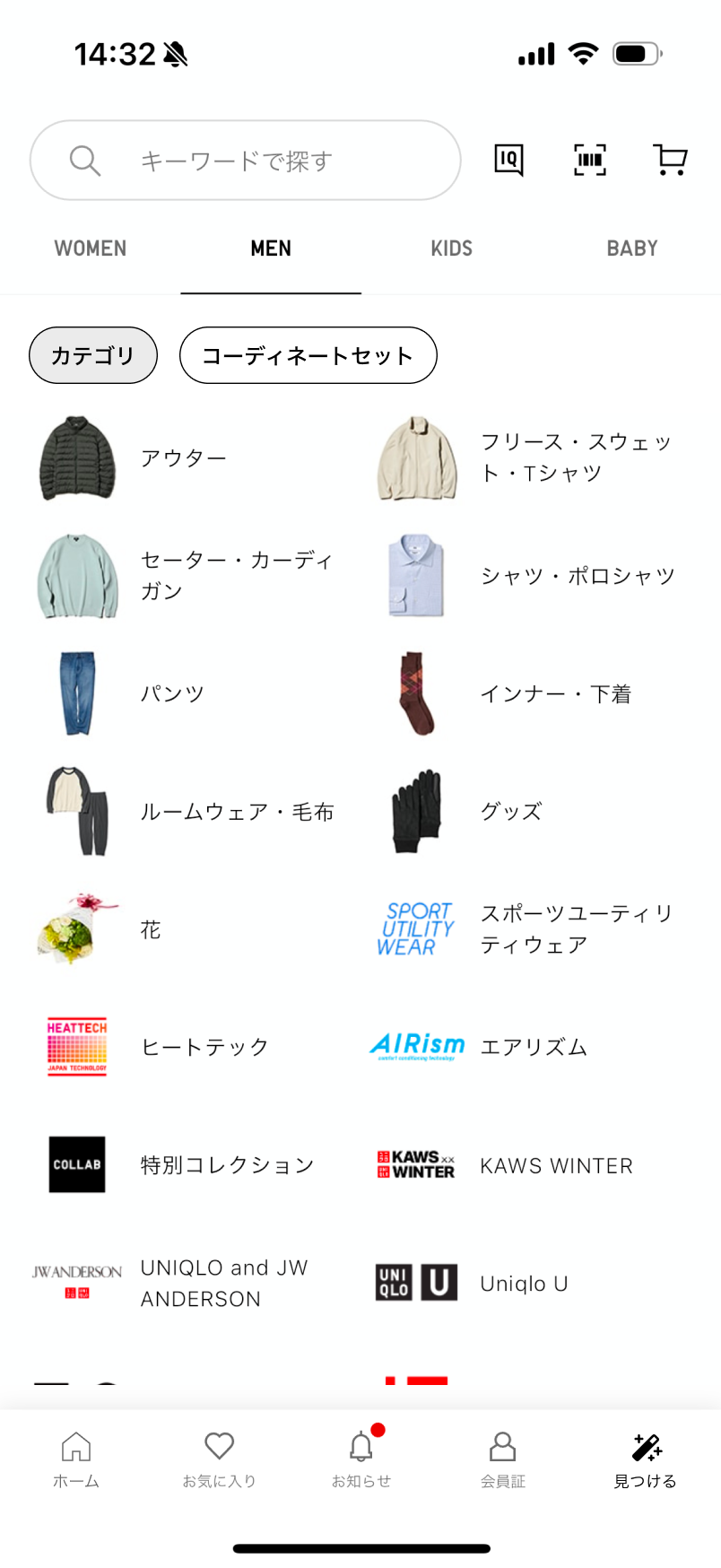
The App Today
Before designing anything, I spent time with the existing app to understand more on what I want when it comes to shopping online.
The app is genuinely good at product-level clarity. But something was missing at the outfit level. Which is how I usually think when I shop online.
Evaluation Summary
The app excels at product-level clarity — size, navigation, and structure. But there's a meaningful gap at the outfit level: how pieces work together, how decisions get made, how inspiration becomes a purchase.
The Pain Points
From my evaluation, three things kept getting in the way.
These weren't hypothetical. They were real friction I felt myself, and that Voice of Customer data confirmed many people felt too.
The Framework
To think about the problem more visually structured, I created a framework for this. Shopping for an outfit online requires three types of confidence, and they need to happen in sequence.
The Design
Each design decision maps to one of the three confidence gaps. Context first, then visual, then action — in the order a shopper actually experiences them.
Discover Menu
Shift the entry point from category-first to intention-first. Before a shopper picks a product, they can declare what they're shopping for — a coordinated look, or a specific category.
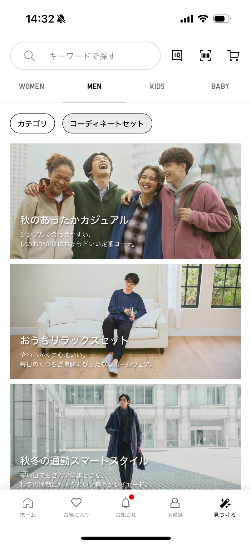
Outfit sets are organized by occasion and season rather than by garment type — a small but deliberate break from the rest of the app's taxonomy.
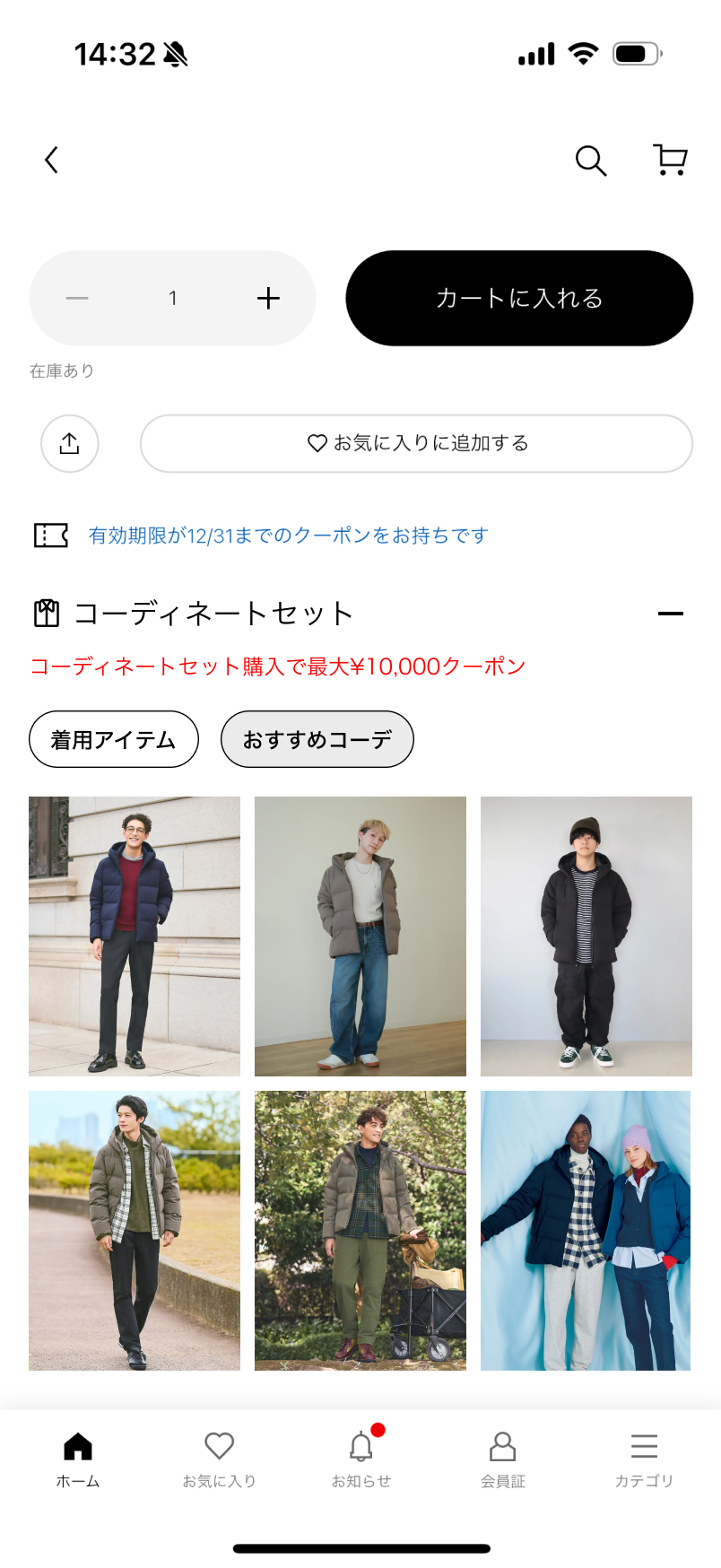
Outfit Detail Page
Once a user enters an outfit, they need to see it as a complete look — and be able to buy it without adding items one by one.
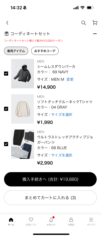
The Outfit Detail Page works like a standard product page, but for an entire outfit. Each item is listed with price, size, and availability. Users can include or exclude pieces. One tap adds everything to the cart.
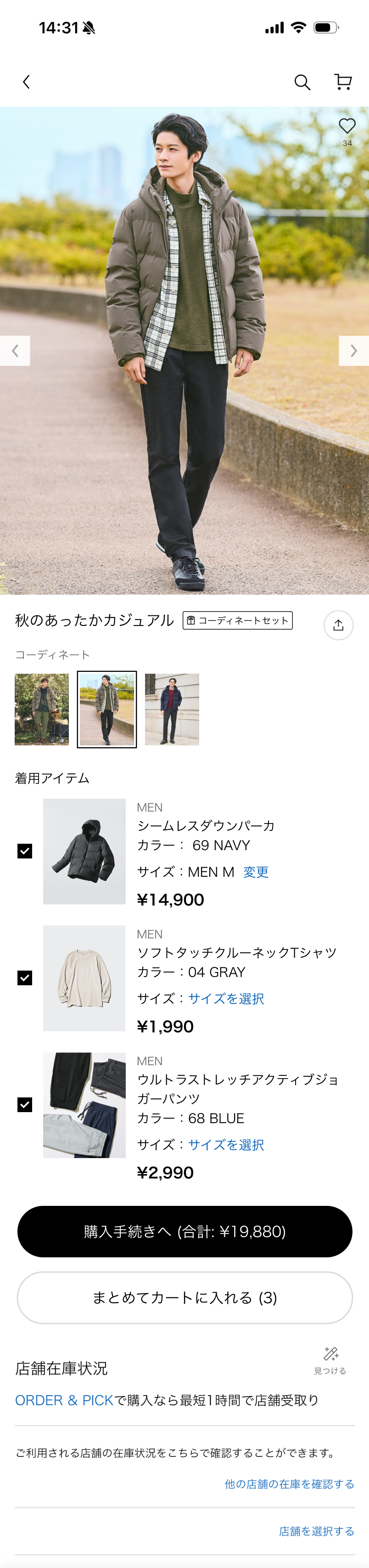
Complete outfit view
A dedicated detail page for a complete outfit, designed like a standard PDP. Users can understand, review, and purchase an outfit as a single decision.
Item-level control
Each item in the outfit is clearly listed with price, size, and availability. Users can include or exclude pieces while keeping the outfit context intact.
Dedicated checkout
Users can add an entire outfit to the cart in one action, while still having full control to adjust individual items. Faster checkout without feeling forced.
Outfit from Item
Discovery doesn't only happen in the Discover Menu. From any product page, users can jump directly into a recommended outfit — seeing how a single item fits into a complete look.
We didn't pick a single entry point — we shipped two. One extends the existing 着用アイテム section so it feels native. The other gives outfits a dedicated block for users ready to see the full look. Together, they meet the two mindsets users bring to a product page.
Two entry points, both shipped
Rather than picking one, we offered both — each suits a different moment as users browse a product.
Defining Success
Good design needs something to measure against. If this shipped, here's what I'd track — and why.
If you shipped this, what would you track first?
Pick 2–3 metrics you'd prioritize.
Closing
I enjoyed this more than I expected as my very first task. The app is mature, which makes finding the right opportunity harder, and more interesting.
Thank you for reading!